From Leads to Sales: A Comprehensive Approach to Lead Generation
May 16, 2024
Mar 18, 2024
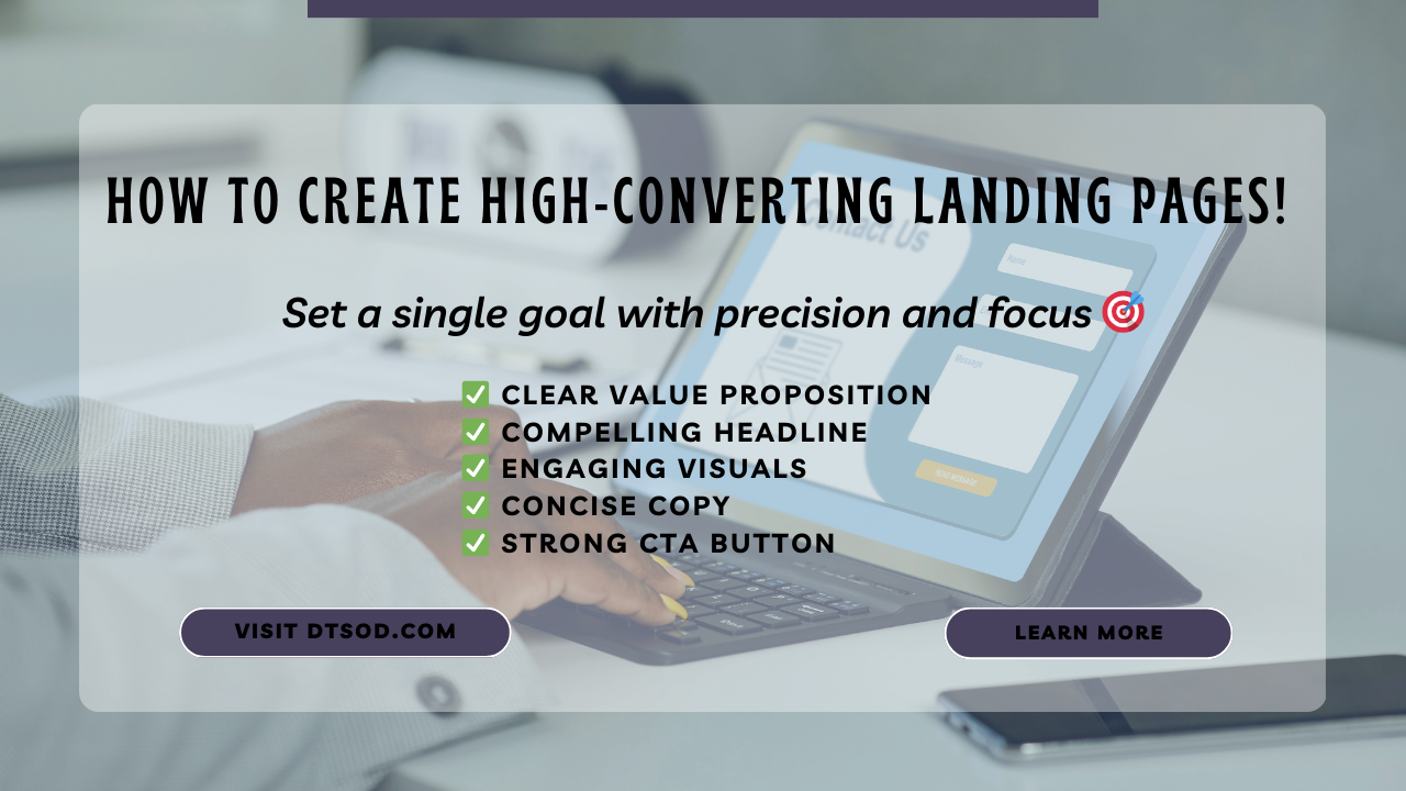
A landing page is a standalone web page created specifically for a marketing or advertising campaign. When a visitor clicks on a link in an email or an ad from platforms like Google, Bing, YouTube, Facebook, Instagram, or Twitter, they “land” on this page. Unlike regular web pages, which often have multiple goals and encourage exploration, landing pages are designed with a single focus or goal, known as a call to action (CTA).
Here’s where landing pages fit into your marketing funnel:
Prospects at the top of the funnel click a link in an ad, email, or elsewhere.
They arrive at the landing page.
The conversion (such as a purchase, signup, or registration) takes place.
The power of landing pages lies in their focused design. Unlike homepages, which have numerous links and distractions, landing pages keep it simple.
They typically have:
A clear value proposition: Communicate what visitors will gain.
A compelling headline: Grab attention.
Engaging visuals: Relevant images or videos.
Concise copy: Benefit-driven text.
A strong CTA button: Encourage action.
By having fewer distractions, landing pages increase conversions. So, if you want to turn visitors into customers, consider using dedicated landing pages for your marketing campaigns!
High-converting landing pages play a crucial role in your online strategy. Let’s explore the benefits of these focused web pages:
High-converting landing pages are powerful tools for capturing leads. They’re where potential customers “land” after clicking on links from email campaigns, display ads, social media posts, or blog articles.
Most websites have a conversion rate of around 2.35%. However, high-converting landing pages can significantly outperform this average.When designed effectively, these pages align with user intentions and provide a seamless experience that persuades visitors to take the desired action. Higher conversion rates mean more successful interactions with potential customers
Landing pages act as special doors to what you offer. They provide a focused experience, guiding users toward a specific call to action.
Unlike general pages (such as homepages or product pages), landing pages have a singular purpose. They eliminate distractions and guide visitors toward a specific goal.
Certainly! When creating high-converting landing pages, it’s essential to focus on specific elements that drive engagement and encourage visitors to take action. Let’s explore these key components:
Your landing page should clearly communicate what sets your product or service apart from the competition.
The hero shot is the primary visual element on your landing page. It could be an image, video, or graphic that represents your product or service.
Make sure the hero shot is visually appealing, relevant, and captures attention immediately.
Clearly outline the benefits of your product or service. How will it solve a problem or improve the user’s life?
Use concise, persuasive language to convey the value users will gain by taking action.
Include testimonials, reviews, case studies, or success stories from satisfied customers.
Your CTA is the gateway to conversion. Make it prominent, action-oriented, and compelling.
The content visible without scrolling (above the fold) should grab attention and provide essential information.
Use headlines, subheadings, and concise text to convey your message quickly.
Remove unnecessary elements that distract from the main goal. Avoid clutter, excessive links, or unrelated content.
Keep the focus on the conversion action you want users to take.
Ensure your landing page is responsive and looks great on all devices (desktop, tablet, mobile).
Mobile-friendly design is crucial, as many users access websites from their phones.
Display trust badges, security icons, or certifications (e.g., SSL certificates) to reassure visitors.
Trust signals enhance credibility and reduce any hesitations users may have.
Continuously test different elements (CTAs, headlines, colors, layouts) to optimize your landing page.
A/B testing helps you identify what resonates best with your audience and improves conversion rates.
A well-crafted landing page combines these elements strategically to create a seamless user experience and drive conversions.
Psychology of Color for landing page:
Colors evoke emotions and influence behavior. Choose colors that align with your brand and encourage action.
For example, blue conveys trust, green suggests growth, and red grabs attention.
Increasing Conversion Rate:
Regularly analyze data, track user behavior, and make data-driven adjustments.
Optimize loading speed, as slow pages lead to higher bounce rates.
Personalize content based on user demographics and behavior.
Use urgency (limited-time offers) and scarcity (limited availability) to encourage action.
Here are some highly effective landing page examples across various industries. These pages are designed to convert visitors into leads, customers, or subscribers. Feel free to draw inspiration from them for your own landing page endeavors:
1. Calm (SaaS: Health and Wellness):
Calm’s landing page focuses on meditation and mental well-being. It uses soothing colors, concise copy, and a clear call-to-action (CTA) to encourage sign-ups.

2. Zola (Ecommerce: Weddings):
Zola’s wedding registry landing page is visually appealing, with a straightforward value proposition. It emphasizes the convenience of creating a personalized registry for couples.
3. CD Baby (SaaS: Entertainment):
CD Baby’s landing page for independent musicians offers distribution services. It features a compelling headline, testimonials, and a prominent CTA for artists to get started.

4. Netflix (SaaS: Entertainment):
Netflix’s landing page is minimalistic, showcasing its streaming service. The focus is on the free trial offer, with a clear CTA to sign up.
5. LinkedIn (SaaS: Professional Services):
LinkedIn’s landing page emphasizes networking and career growth. It highlights the benefits of joining the platform and encourages users to create profiles.
6. Goby (E-commerce: Health and Wellness):
Goby’s electric toothbrush landing page is clean and informative. It uses visuals, social proof, and a straightforward CTA to drive sales.
7. DoorDash (SaaS: Food Delivery):
DoorDash’s food delivery landing page focuses on convenience and variety. It prompts users to order food with a prominent CTA.
8. SEM Rush (SaaS: Marketing):
SEM Rush’s landing page offers SEO tools. It uses a clear value proposition, testimonials, and a free trial CTA to attract marketers.
9. Coco Village (Ecommerce: Furniture):
Coco Village’s kids’ furniture landing page showcases playful designs. It features product images, pricing, and a CTA to explore collections.
10. Amazon (SaaS and Ecommerce):
Amazon’s landing page is a masterclass in simplicity. It highlights deals, product categories, and personalized recommendations
These examples demonstrate effective practices such as clear value statements, focused CTAs, and user-friendly layouts. Adapt these principles to create your own compelling landing pages!
In summary, high-converting landing pages are essential for driving successful online campaigns. By focusing on elements like a clear value proposition, engaging design, compelling CTAs, and trust-building social proof, advertisers can create landing pages that not only attract visitors but also convert them into valuable leads or customers. Remember to continuously test and optimize your landing pages to achieve the best results.
Ready to Boost Your Conversion Rates?
Visit our website at DTSOD.com and discover how our customized landing pages can supercharge your online presence. Whether you’re aiming for more leads, increased sales, or better engagement, we’ve got you covered!
Transform Visitors into Subscribers: Get exclusive content delivered straight to your inbox.
Experience Seamless User Journeys: Our designs guide users toward action effortlessly.
Build Trust with Social Proof: See how satisfied customers have benefited from our services.
Optimize for Mobile: Reach your audience wherever they are.
Don’t miss out! Take the next step toward digital success. Click here to explore our services and customize your landing page today!
Related Topic:
How Social Media Can Solve Retail Marketing's Biggest Problems in 2024
Optimizing Your Ad Strategy - The Top 10 Google Ads Best Practices
How AI's Impact on Social Media Marketing Success
Comments